Purchase Tickets
The Cows in the Post Office
April 20, 2018

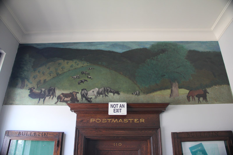
The citizens of Rockville were not pleased. The U.S. Treasury Department’s Section of Painting and Sculpture had promised them a mural for their post office, full of local character. In the summer of 1939, however, they received a modernist scene of jutting, protuberant hills and lumpy, misshapen cows.
Rockville’s mural is one of my favorite Indiana post office murals, but it’s easy to see why it was initially rejected. Many Rockvillians were farmers, and thus experts on both the local topography and bovine anatomy. They felt slighted and imposed upon. The artist, Milton Avery, was a New Yorker who had never set foot in Indiana. Completely unfamiliar with the state’s landscape and without the funds to travel, he had based his design on images of rural Connecticut. “Of course if I could just drop into Indiana it would make a difference,” he wrote to the Section of Fine Arts, “…but it is a little far away.”
Edward Rowan, Assistant Chief of the SPS, urged Avery to reconsider his rendering of the animals. “I am perfectly aware of your good judgment in aesthetic matters but am constantly reminded that [you’re] not painting for me but for the citizens of Rockville.” In the end, Avery modified the animals’ proportions to be more naturalistic. This may have been due to careful consideration of his audience’s needs, but it also may have been due to the fact that Rowan withheld payment from him until Rockvillians finally approved the design.
The exchange between Avery and Rowan is one of the delightful elements I’ve come across in IHS’s Indiana Post Office Murals Research Collection, which comprises the unpublished research and writings of Robert and Martha Van Sickle. Over the course of several decades, the Van Sickles gathered correspondence, articles, and images related to forty-two Depression-era SPS projects across Indiana. To me, the collection materials reveal a government deeply invested in providing employment for artists in need. They also show a public whose artistic tastes favored traditional representation over modernist experimentation.

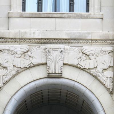
Here is an image of the only sculptural work profiled in the collection, the winged letters carved above the doors of the U.S. Courthouse and Post Office – now the Birch Bayh Federal Building. I include them not only because their mashup of Renaissance and Art Deco forms perfectly balances tradition and experimentation, but because what’s more delightful than letters with wings? I can almost hear them saying “wheeeeee!” as they zoom off to recipients across the globe.
A guide to the collection can be found here.
Photos courtesy of The Living New Deal at livingnewdeal.org.


